Table of Contents
ToggleWebsite design and build for a head spa in London. 2 weeks, brief to launch.
Built for the person paying for the treatment, not only the person receiving it.
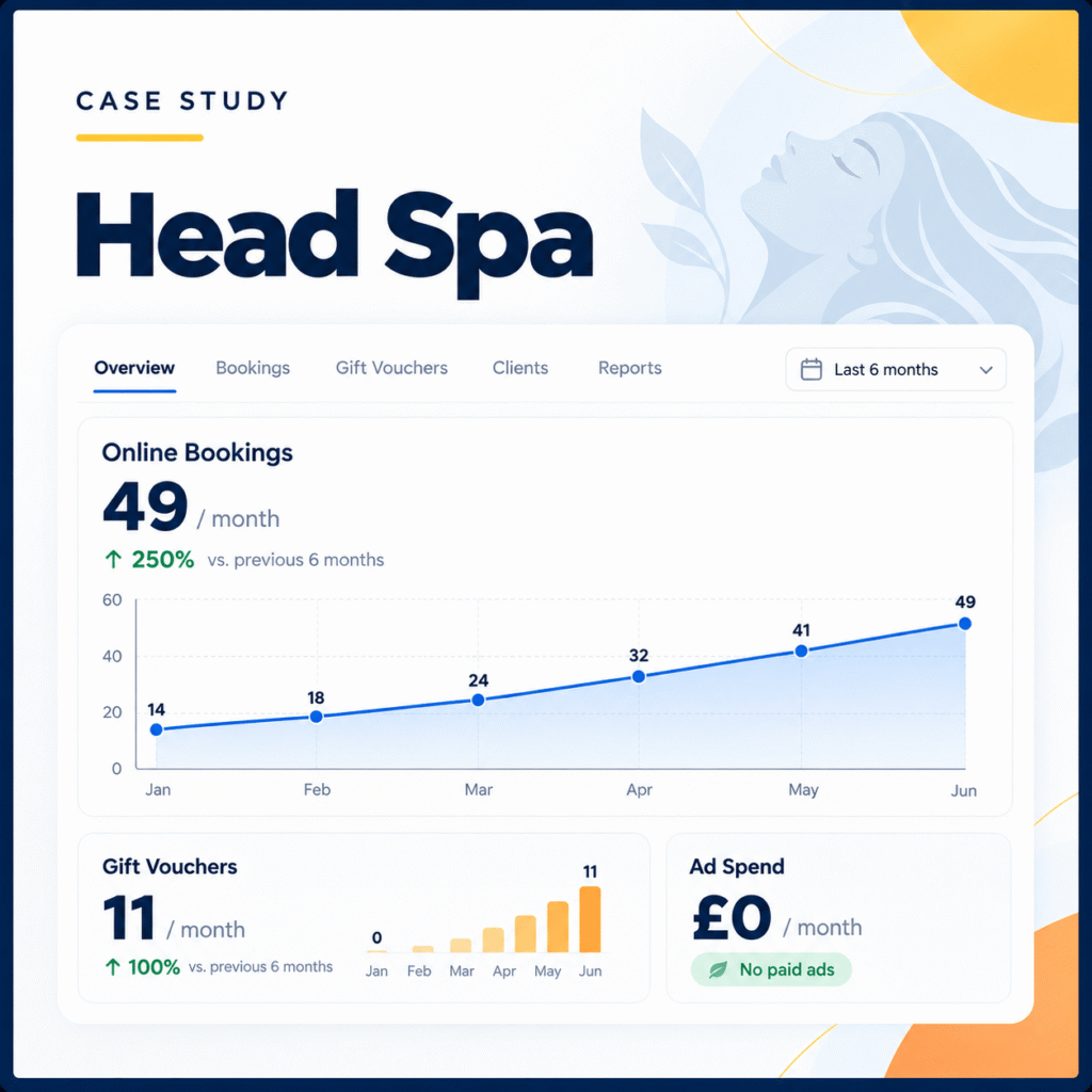
14 to 49 online bookings a month, 6 months after launch.
14 → 49
online bookings a month
2 weeks
brief to launch
£0
on advertising
Overview ( spa website design case study)
What we solved: Conversion · Messaging
| Business | Head spa, single studio, London |
| Treatments | Japanese and Korean head spa rituals, duo treatments, gift vouchers |
| Before | No website. Instagram and TikTok reels, with a booking link in the bio |
| Scope | Website design and development |
| Timeline | 2 weeks from brief to launch, April 2025 |
| Result | 14 to 49 online bookings a month and 0 to 11 gift vouchers a month, 6 months after launch |
| Advertising | £0 |
The problem ( Instagram followers not booking )
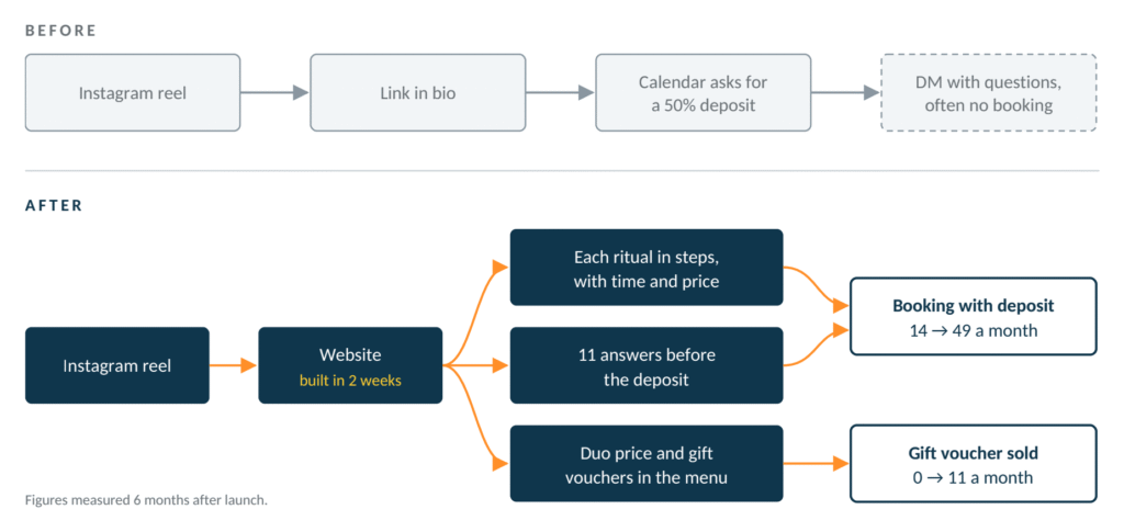
The studio was already being found. Its ASMR reels were getting watched, saved and shared across Instagram and TikTok. Every one of them ended the same way: a link in the bio that opened a booking calendar and asked for a 50% non-refundable deposit.
Nothing sat between the reel and the deposit. No explanation of what happens across 75 or 90 minutes. Nothing on pregnancy, braids, or whether the therapists are women. So people sent a DM instead, and the owner answered the same questions every evening. Many of those conversations never became a booking.
A second group had nowhere to go at all. A large share of the people watching weren’t booking for themselves. They were looking for a birthday present, or something to do with a sister or a friend. The bio link offered them a calendar, when what they needed was a voucher.
“I knew the treatment was good. What I didn’t have was anywhere that explained it properly before someone paid a deposit.”
Owner, head spa, London
4 things we found reviewing a London head spa
1. The person paying often wasn’t the person being treated
The studio’s reviews kept describing the same booking: a best friend’s birthday, a sister, a treat for a friend, a duo for two. A gift buyer doesn’t want a calendar. They want a voucher in any amount, and a duo option with a price on it.
2. A non-refundable deposit needs a full picture first
Nobody pays 50% upfront for a treatment they can’t picture. Every step of each ritual, its length and its price had to be visible before the Book Now button, not after it. It is the same move as answering the funding question before the phone call: remove the doubt before the visitor has to ask.
3. The questions stopping bookings were predictable
Pregnancy, extensions and braids, washing hair beforehand, women-only therapists, running late, rescheduling. Every DM asked one of them. Each one answered on the page was one less reason to wait.
4. Two rituals suit two different clients
The Japanese ritual is for deep relaxation and isn’t offered during pregnancy. The Korean ritual is for visible scalp results and is pregnancy-safe. Clients search for each by name, the same principle behind building one page for every condition a patient searches for, and they need to know which one is theirs before they reach the calendar.
6 things we built ( website design for spas and salons )
WHAT WE DID | WHY WE DID IT |
|---|---|
Put Gift Vouchers in the main menu, going straight to a purchase page in any amount | The gift buyer is a separate customer and shouldn’t have to find a voucher inside a booking flow |
Listed the duo treatment with its own price beside the single | Occasion bookings are usually for two. A visible price ends the “can we come together” message |
Broke each ritual into its steps, with the duration and price alongside | The deposit is non-refundable, so the visitor needs to see exactly what they are paying for |
Wrote 11 answers covering pregnancy, extensions, hair washing, women-only therapists, lateness and rescheduling | Each one was a DM that delayed a booking or lost it |
Placed Book Now in the header and after every treatment, going straight to the calendar | No contact-form detour between deciding and paying the deposit |
Named and separated the Japanese and Korean rituals by who they suit | Clients search by name, and pregnancy decides which one they can book |
Image: head-spa-site-structure.png, with the caption “The booking path before and after launch.”
2 weeks, brief to launch
DAYS | WHAT HAPPENED |
|---|---|
Days 1 to 3 | Review of the questions arriving by DM, the studio’s Google reviews and competing London head spas. Page structure and treatment order agreed |
Days 4 to 8 | Design and copy for the homepage, treatments, FAQ and contact page |
Days 9 to 12 | Build in WordPress, booking and voucher routes connected, mobile testing |
Days 13 to 14 | Content review with the owner and launch, April 2025 |
14/mo to 49/mo bookings in 6 months ( online booking )
MEASURE | BEFORE LAUNCH | 6 MONTHS AFTER LAUNCH |
|---|---|---|
Online bookings a month | 14 | 49 |
Gift vouchers sold a month | 0 | 11 |
Where a reel sends a visitor | A deposit calendar | Treatments with steps, time and price |
Advertising spend | £0 | £0 |
Before: the month before launch, March 2025. After: October 2025.
Why it worked
The reels were already doing their job. What was missing was the step between wanting the treatment and paying for it. The website filled that gap with the answers a deposit raises, so a visitor could decide without messaging first.
It also treated the gift buyer as a customer in their own right. Vouchers and the duo price sat one tap from the menu, so the person paying had somewhere to go that wasn’t a calendar.
Nothing was spent on advertising. The audience was already there. The website stopped losing it.
FAQ
How much does a website cost for a spa or salon?
Our builds start at $2,500 and depend on page count and scope. A single-studio site like this one, with treatments, FAQ, contact and booking connected to the system you already use, sits toward the lower end. We quote a fixed price after a call, once we know the pages you need.
Source: searched question, “how much does a website cost for a spa or salon”, with results from Ueni and ColorWhistle answering it.
Does a spa need a website if it already has Instagram?
Instagram creates the want. It doesn’t answer the questions a deposit raises. This studio’s reels were already bringing people in, and they were leaving at the booking calendar. The website gave them the steps, prices and answers first, and bookings rose from 14 to 49 a month in 6 months.
Source: searched question, “does a spa need a website if it has Instagram”, with results from Dermascope and EasyWeek.
How do I get more bookings from Instagram?
Look at where your bio link sends people. If it opens a calendar or a deposit straight away, a stranger has to decide before they understand what they are buying. Send them to a page that explains each treatment step by step, answers the common questions, and puts Book Now after the explanation.
Source: searched question, “how to get more bookings from Instagram”, with results from Square, Zenoti and Treatwell.
How do I sell gift vouchers on my spa website?
Put Gift Vouchers in the main menu, not inside the booking flow, and let the buyer choose any amount. Most booking systems, including Timely, have a voucher checkout you can link to directly. For this studio that one change took voucher sales from none to 11 a month.
Source: searched question, “how to sell gift vouchers online”, with results from Timely, Kitomba and MioSalon.
How long does it take to build a spa website?
This one took 2 weeks from brief to launch: 3 days of research, 5 of design and copy, 4 of build and testing, and 2 for review and launch. Larger sites with more treatments or locations take 3 to 6 weeks.
Source: searched question, “how long does it take to build a website”, a standard autocomplete query.
Your audience finds you. Does your website let them book?
We’ll look at the path from your Instagram or Google profile to a paid booking and show you where people drop off. 30 minutes, screen-shared, no cost.